The details of which can be found here.
Definitions
From Wikipedia - Sept 2011
Commercial photography is probably best defined as any photography for which the photographer is paid for images rather than works of art.
In this light money could be paid for the subject of the photograph or the photograph itself.
Wholesale, retail, and professional uses of photography would fall under this definition. The commercial photographic world could include:
▪ Advertising photography: photographs made to illustrate and usually sell a service or product. These images, such as packshots, are generally done with an advertising agency, design firm or with an in-house corporate design team.
▪ Fashion and glamour photography usually incorporates models. Photographers here are paid more because of the demand for good photographers to shoot the item being sold and incorporate the models beauty in the image. Fashion photography like the work featured in Harper's Bazaar emphasizes clothes and other products; glamour emphasizes the model and body form. Glamour photography is popular in advertising and men's magazines which means these pictures are more revealing than editorial fashion photography. Models in glamour photography sometimes work nude.
▪ Still life photography usually depicts inanimate subject matter, typically commonplace objects which may be either natural or man-made.
▪ Food photography can be used for editorial, packaging or advertising use. Food photography is similar to still life photography, but requires some special skills.
▪ Editorial photography illustrates a story or idea within the context of a magazine. These are usually assigned by the magazine.
▪ Photojournalism can be considered a subset of editorial photography. Photographs made in this context are accepted as a documentation of a news story.
▪ Portrait and wedding photography: photographs made and sold directly to the end user of the images.
▪ Landscape photography depicts locations.
▪ Wildlife photography demonstrates the life of animals.
▪ Paparazzi
Magazines and newspapers, companies putting up Web sites, advertising agencies and other groups pay for photography.
Organizations with a budget and a need for photography have several options: they can employ a photographer directly, organize a public competition, or obtain rights to stock photographs. Photo stock can be procured through traditional stock giants, such as Getty Images or Corbis; smaller microstock agencies, such as Fotolia; or web marketplaces, such as Cutcaster.
Scamps
Scamp - a first rough or mockup usually used in artworking terms
This drawing could be very technical or a simple stick drawing depending on the creative team or art director.
An example of a scamp can be found here

Commercial/Product images can be used for various purposes; advertising, internet shops, catalogues, and could be commissioned by the manufacturer, designer, or a retailer. They could include celebrity endorsement, be part of an ongoing campaign or be a stand alone feature. Dependant on their end use, the image may have to encompass text, branding or specific size/format criteria.
Whiskey


Other commercial images


Research into shot production
Watches - Article here
Jewellery - Article here
Specific kit requirements for watches - click to view
Tricks of the trade - using foil and cardboard - click here to view
Photo stacking for sharp focus points - click here to view
More on photo stacking - click here to view
Video tutorial, product shot, background shot and merging the two -
Link to You Tube
Christopher Ward


We are a small English watchmaker with a simple aim ... we want to put premium quality watches within the reach of everyone.


Our design scamps for the watch are for a horizontal strip ad (1/4 or 1/3 page size) and for a full page portrait space, but the image to be used is the same, so when shooting I have left enough space around the product for the different aspect ratios.


The watch itself has been particularly tricky to shoot as it is a black metal watch with a black face. The brief calls for a black or dark background but in order to shot the product correctly I've had to use a plain white perspex product table and will have to merge in a background - which worries me as my photoshop skills are not to a design agency standard.
The watch glass is very thick and bevelled, and any angle (as in main ad image) causes heavy distortion on the view of the clock face. We could tale the glass out, however the watch n this case is a 'prototype' and we are not allowed to dismantle it in anyway.
Watches are shot with the hands in a particular position to represent a 'happpy' face, so placing them is important and also dictated by the brief - however in order to move these hands - the winder has to be unscrewed. To get the 1.50 time the logo etched on the winder is upside down and the moment the winder is screwed back into place, the hands are activated and the second hands (and all the others) begin to move.
The lighting set up was a bit trial and error to avoid any reflections in the glass. I tries continuous lighting and a light box, but opted to use flash in the end to enable be to close down the aperture and get maximum depth of field for the straight on product shot. I also used lots of card to act as a reflector into the watch face but also to block out any background image that could be reflected.
I also used the studio stand to get the camera directly above the watch.


Scamps
Scamp - a first rough or mockup usually used in artworking terms
This drawing could be very technical or a simple stick drawing depending on the creative team or art director.
An example of a scamp can be found here

Research Images
Commercial/Product images can be used for various purposes; advertising, internet shops, catalogues, and could be commissioned by the manufacturer, designer, or a retailer. They could include celebrity endorsement, be part of an ongoing campaign or be a stand alone feature. Dependant on their end use, the image may have to encompass text, branding or specific size/format criteria.
Whiskey


Watches (my product)


And some very 'alternative' commercial images for watches


Premium Brands


Fashion Brands
Creative Commercial

Handbags


Julia Fullerton-Batten for Nobody's Children Foundation

Julian Wolkenstein for Lynx
Nigel Harniman for Mars Ice Cream
Josh Cole for Metropolitan Police


Michael Schnabel for O2

Paul Rees for NHM

Tim Wallace for Aston Martin

Food and Drink by Steve Wright

Meridiana Airlines by John Turner

Watches - Article here
Jewellery - Article here
Specific kit requirements for watches - click to view
Tricks of the trade - using foil and cardboard - click here to view
Photo stacking for sharp focus points - click here to view
More on photo stacking - click here to view
Video tutorial, product shot, background shot and merging the two -
Link to You Tube
The Watch
Christopher Ward

The Brand
(taken from website)
Three Men In A Boat
The Christopher Ward watch company was founded on a boat on the River Thames in 2004 by Mike France, Chris Ward and Peter Ellis.
From the start this has always been about finding a way for everyone to enjoy the truly visceral pleasure derived from owning and wearing a premium quality Swiss made watch.
Vive La Revolution!
Having learned from insiders in the Swiss watch industry just how much of the cost of a typical luxury Swiss watch is marketing hype, the three friends set out on a mission to turn the traditional model on its head and create a revolution in watchmaking.
The phrase they instantly came up with that encapsulated the mission they were about to embark on was that they wanted to create..."the cheapest most expensive watches in the world."
Chris was the man with the watch making expertise, Mike and Peter, who previously owned the renowned Early Learning Centre chain of educational toy stores, brought the retail know-how.
D-Day, June 4th, 2005
Having spent the best part of a year designing our first two watches, the C5 Malvern Automatic and C3 Malvern Chronograph, they were launched, via our website, onto an unsuspecting world in June 2005. The reaction was astonishing......
The Power of The Internet
Watch forums across the world were inundated with disbelieving watch aficionados’ claiming watches at this price couldn’t possibly be of the quality claimed. At one point in December 2005 our fledgling brand was being discussed more frequently on the world’s largest watch forum, Timezone, than Rolex!
And then, unbeknown to us, one of the world’s most influential watch bloggers, Dave Malone from Australia, purchased a Malvern Automatic with the intention of exposing the myth. To his eternal credit, having received his watch and being blown away by every aspect of it, he wrote a stunningly complimentary post which whizzed around the watch world like wild fire. Christopher Ward had arrived!
We are a small English watchmaker with a simple aim ... we want to put premium quality watches within the reach of everyone.
To achieve this we have inverted the usual business model used by brands such as Breitling, Tag Heuer and Omega. The manufacturing costs of our watches may be similar to theirs but that’s where comparisons end.
Christopher Ward or Brad Pitt?
Our competitors spend millions in the creation of “brand halos” around their watches through multi-national advertising campaigns, high profile sponsorships and celebrity endorsements. Marketing is, of course, an important part of any business but when the cost of marketing runs to many times the cost of the product, as is often the case in the luxury watch industry, it seemed to us, to quote the bard, that “something is rotten in the state of Denmark.”
Our marketing spend as a percentage of the watch price is a fraction of our competitors and we may not, therefore, reach as many people as quickly as our competitors, but when we do we seem to delight more often than not - and if you do see Brad Pitt wearing a Christopher Ward watch at least you'll have the satisfaction of knowing he paid for it himself!
No Middlemen
The traditional Swiss brands are sold through third party retailers. This means that their wholesale prices (already inflated by huge marketing costs) are then doubled by the retailer before the final price tag is attached. Again, the Christopher Ward way is different.
We sell directly to our customers through our own website and over the phone through our brilliant customer services team. This alone means the selling price of a Christopher Ward watch is halved. Therapeutic, isn’t it!
Honest Pricing
Finally, because we want as many people as possible to enjoy the pleasure associated with owning and wearing a truly luxurious watch we make sure that the cost benefits of our model, described above, are shared equally with our customers.
Our passionate belief in “honest pricing” means that the selling price of a Christopher Ward watch is between 2 and 3 times the base manufacturing price. The luxury watch industry average is nearer 10 times and we have an example of a well known watch that retails for 30 times the manufacturing cost.
We think these multiples are completely unwarranted and exist because there has been no benchmark premium watch brand with an alternative philosophy. Until now.
Feature Advertorial

Advertising size guides
When creating an image which is to be used for commercial purposes, the end use must be considered. If the image is used for advertising purposes, then the client will have bought a set amount of space in which to use the image and any associated text (in the case of an advertorial)
Print and web pages vary the standard space specs available, so it's imperative that the photographer find out the size and orientation and colour requirements of the end product.
Brand Guidelines
Many companies work hard to create a brand image that resonates with its target audience, whether that is identified by location, age group, disposable income or a combination of factors. Once a brand image is established, companies produce guidelines, so that multiple 3rd parties can work on the same or separate projects but each output will remain true to the companies intended look and feel.
Guidelines can include such things as;
- Pantone colours
- Fonts
- Size and location of logo
- Multiple logos for specific uses
- Style of imagery
- Subjects within imagery
- Templates
- online specifications
A good example of a very thorough brand document is that of Oxfam, which clearly states the style of any photographic imagery held within its marketing material.
Business Issues
One must keep in mind the business issues related to commercial photography, to protect the yourself and your images.
Things that may be essential/considered will be;
- Estimate
- Invoice
- Contract
- Terms and Conditions
- Copyright agreements
- Usage rights
- Credits
- Medium and distribution considerations
- Model release forms
- Deadlines
- Amendments to terms/job
- Billing dates and credit control
- Delivery methods
- Clauses
- Captioning/key wording
- Agency requirements
- Legal restraints - in terms of this issue, the Advertising Standards agency is he main body in this country but as images can be distributed world wide with relative ease, it is important to consider the tastes and codes of other countries. The demographics of the client audience will help in this regard, but images can be 'pulled' even when they are within the code of practice, if they anger or upset the general populous.
There are many resources to help businesses with the above, and whilst this has been covered in other modules, here are some of the organisations and pages that I find most useful.
Image Selection article
Codes of conduct & Marketing ethics
Copyright
Business start up solutions
Contracts and legal forms
Image plagiarism
A recent advert was pulled by the manufacturer after it received adverse feedback on a Radio 2 broadcast.
The image featured a veteran soldier who was badly injured during an operation, endorsing a vitamin pill.
The advert was within all the codes and laws set out by the ASA, but public opinion was so strong, both towards the soldier and the manufacturer, that they withdrew it from print.
Boots however, sponsored the ad - note their logo, and came under no scrutiny in their involvement.
this demonstrates that public opinion is both fickle and has double standards.

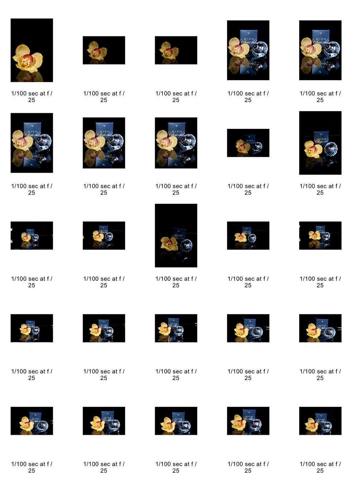
Test Shots


The watch itself has been particularly tricky to shoot as it is a black metal watch with a black face. The brief calls for a black or dark background but in order to shot the product correctly I've had to use a plain white perspex product table and will have to merge in a background - which worries me as my photoshop skills are not to a design agency standard.
The watch glass is very thick and bevelled, and any angle (as in main ad image) causes heavy distortion on the view of the clock face. We could tale the glass out, however the watch n this case is a 'prototype' and we are not allowed to dismantle it in anyway.
Watches are shot with the hands in a particular position to represent a 'happpy' face, so placing them is important and also dictated by the brief - however in order to move these hands - the winder has to be unscrewed. To get the 1.50 time the logo etched on the winder is upside down and the moment the winder is screwed back into place, the hands are activated and the second hands (and all the others) begin to move.
The lighting set up was a bit trial and error to avoid any reflections in the glass. I tries continuous lighting and a light box, but opted to use flash in the end to enable be to close down the aperture and get maximum depth of field for the straight on product shot. I also used lots of card to act as a reflector into the watch face but also to block out any background image that could be reflected.
I also used the studio stand to get the camera directly above the watch.

Studio stand
I used a piece of shaped plastic to hold the watch in the position required (as though being worn) designed especially for holding watches.
I also used a small LED light to place light on the bevel and winder - although I am not entirely happy with this as it hasn't really picked out the etched logo.
Initially the LED was not showing as the light from the flash heads was too strong, so I used a long stuffer speed and remote trigger, and turned off the modelling lights on the flash heads. This technique (similar to the esoteric lighting session in yr one) allows the image to be sharp (because of the flash) but then the light from the LED is picked up from the long shutter. It is vital that the camera and product are still otherwise you would get a blurry image.
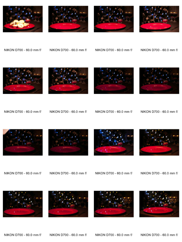
These are some of the test shots showing;
Trial and error on a black background using a tube to hold the watch
Different positions to avoid reflections
The correct equipment to hold the watch
The light on the bevel and winder
Getting the exposure right


I am not happy with the quality of any of the shots, I think the lighting was good - enough to get all the detail, but i think I should have used the better macro lens (from college) instead of persevering with my own as the images just aren't sharp enough.
I am also disappointed with the watch holder, mine was white leatherette, and I think a better result would have been gained by using a clear perspex rigid one - and maybe on some kind of stand as the 'flexi arms' I used were not sufficient to hold the watch in place without causing an obstruction.
The light directed onto the 'CW' detail on the winder is also not sufficient to fulfil the brief, however, I have to hand this in, so I must acknowledge my errors and move on.
More Test Images
My photoshop skills are not any where near the standard required for this kind of work, so I have struggled, the brief calls for a black or dark background, but I thought that a patterned background may look better, however I can't find anything within creative commons licence that would both fit the brief and tie in with the ethics of the watch company. I can not find any marketing campaigns for the company either so it is hard to see if they have any branding guidelines.
(Branding guidelines dictate what a company's external marketing material should look like; for example if a logo can only be used in a certain pantone colour and/or position - see here for an example of branding guidelines Click )
Lighting Diagrams
Here are rough diagrams of the lighting set ups I employed and tried.

I have edited the two individual shots that would be used for the overall advert.
On a plain black background the watch just looks like a paper cut out


I found it very difficult to get the watches looking exactly the same in terms of colour, hue and saturation - even though they were taken on the same day under the same lighting conditions.
Then I have tried to mock up an ad to see if I have the size/proportion right.
In the end I opted for a mottled background, but I am still not happy with the results, although the face is in focus and you can see the logo detail.
My first attempt uses a night sky background with the watch re sized and placed in the bottom corner, the image looks too much like a cut out stuck onto another picture and it took me far longer than expected. The dark tones in the image don't match up as they are in different palettes (although I thought the blue lighting might match up to the 'star like' highlights in the background) and the background images resolution isn't high enough to make the required size of advert.

The watch size is too big in proportion to the scamp.
I used layers and adjustment mask at a high magnification to get as close a cut out as possible to the watch edge.

I am glad that my aspirations do not include product photography as it is the highly skilled technical side of the industry. I find the lack of creativity allowed very frustrating, and I am not happy with the end result.


The images above have the following issues;
- Dust spots
- Strap twisted
- Blue tint on polarised glass
I have tried to rectify these issues and have produced the following
Product Shots


On Reflection
I have found this brief very difficult, and I will be re-shooting (a different) watch to try and correct the issues and problems I encountered.
Some of the feedback I received was easily corrected -
- The watch having marks and flaws on the body
- The colours not 'looking' right
- The product not being straight
Some feedback will be harder to correct -
- The watch position not being exactly to the scamp. This is a tough one, as in preparation I did try and line the product up, but the bevel on the glass made it virtually impossible to see the watch face on this angle. If this were my brief in a real commercial studio, options like taking the glass out of the watch or employing a graphic designer to 'comp' two shots together would be available.
- The watch face not being sharp and in focus. This is in part due to the glass, but the main reason for this is the lens I used. When re-shooting, I will use a sharper macro lens.
- Hands not in right position. Again in a real life situation we would be able to take the batteries out of the product.
Marks
During a peer review we all scored out work. My average mark was 68% which surprised me as I marked myself much lower.
My actual mark from tutors was 50%
I am happy with this because, it is where I would put myself, so in terms of knowing what quality is required, it was no great shock.
Compared to the grades of the rest of the class, I can take some comfort that I was in the top 'few', which means that whilst the work was not of a commercial standard, and only as good as what I would have marked it, it was also amongst the better efforts.
Action Plan and Forward Planning
In order to improve my work and get ready for the next part of the module these are the things I must prepare/action/practice.
- Reshoot a watch learn from all the above to get a 'perfect' image without taking on any of the graphic design role (clipping/placement)
- Buy a product table
- Use the proper lens for the task, if it requires a macro - rent one
- Decide on my own product shoot to use going forward
- Research other images and practitioners who work in this field
- Shoot my own product both in terms of product 'pack shot' and a creative image
- Show from these shoots, contact sheets, concept, purpose and placement of image as well as any research into brand and demographic.
- Potential products that tie in with other work - Rouge Millinery.
Other commercial photographers

Northlight Images
Researched as part of the Industrial Landscape for Individual Practice & Editorial Modules

Ikon Photography
Examples of interior and product imagery


Neilson Photography
Examples of Jewelry Images

Amanda Maddox
Tie Rack

It's always worth bearing in mind that 'Commercial' does not always mean 'Product'
Above are some images from the AOP gallery that are Commercial, Editorial, Fine Art & Conceptual
In view of the work I am doing with Rouge Millinery, I am also researching commercial images of hats.


Above are some searches of the Getty image database to give me an idea of what is available already
These are some images used by hat retailers

John Lewis
Professional large retailer employing simple styles online product imagery


Bespoke retailers offering a small ready to wear collection and bespoke pieces
The products are on a stand rather than a head
The items are also in a more domestic setting, in acknowledgment to their 'handmade' origins


The products are no being shown on people with a more realistic view of what they would be like to own, styles vary dependent on the style of the product and the branding behind the company.
Rouge Millinery is a new company, with no set branding policy as yet. The hats are designed and created by the owner who is trained in Interior Design, Contemporary Textiles & Millinery, through UCBC and Leeds College of Art.
The hats are made using vintage hat blocks employing traditional methods with a modern and punchy edge to the finished product.
High quality materials are used including sourcing vintage pearls and feathers to complement new fabrics.
Each piece is lovingly made by hand on a bespoke made to order service.
The images I will be taking are for a range of uses;
- Product images for online sales
- Vintage styles head and shoulder shots for printed media
- 'By hand' Craft shots showing the intricate process of hat making for website information
- Lifestyle type images for advertorial purposes
I have also completed work surrounding image rights, contracts, invoicing and creative brief agreements.
(Links to these will follow with permission from Rouge Millinery)
Head and shoulder shots
The images required where to be full colour, head and shoulder, hat in focus, mixture of full face straight on & tilted head shots. The request was also quite specific in terms of processing; heavy vignettes and dark backgrounds, no dramatic lighting.
In terms of size etc, no specific size or orientation required, size and orientation largely dependent on location of hat detail and size of hat.
File sizes in hi res Jpeg and web optimized file format.
Here are some of the images that have been chosen to fulfill this particular portion of the brief

Ongoing inspiration
Because I am more drawn to fine art, it is important for me to stay in touch with the work that is available through galleries and how it can influence my commercial & editorial work.
Here are some exhibitions I am currently interested in and that I regularly receive updates from.

Michael Wolf at Flowers Gallery

Elina Brotherus at The Wapping Project

Margarita Gluzberg at paradise Row

Annie Leibovitz at Hamiltons
Pricing
An interesting article surrounding pricing jobs taken from A Photo Editor Blog
This blog on the whole contains a lot of interesting information from first hand experiences.
Own Images Ideas, rationale, contact sheets, editing, selection, final images - The report